The "Vinopolis" winery, active for 50 years in the sector, has decided to renew itself through new production and human resources. The goal is to consolidate the Italian market and grow in exports. To do this, a rebranding of its historic brand is requested.
Logo Design Process
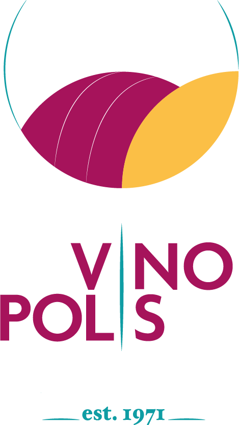
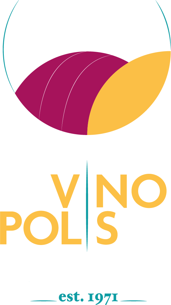
We will combine two key aspects in the logo: the glass and the vineyards. The first aspect will recall the product and its consumption by the customer. The vineyards, on the other hand, will recall the innovations implemented by the company and the naturalness of the product. We want to make the customer perceive that the history, quality and research of the product are contained within his glass of Vinopolis wine.
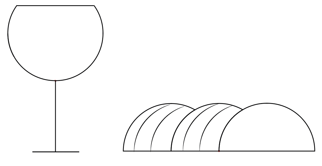
Logo Design Process 1

Logo Design Process 2
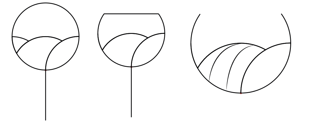
Logo Design Process 3

Logo Design Process 4
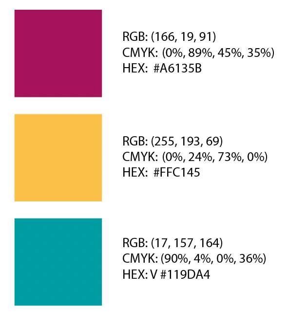
COLORS
The two most represented have an explicit reference to the main colors of the wine while the third supporting one recalls the glass of the goblet.
FINAL RESULT
The basic logo is integrated within the logotype with the name of the company and the date of foundation of the same (1971) which are inserted to increase the illusion of the glass. The logotype is proposed in two colors so that it can be used easily depending on the product.